Writing & Design
How to tell your story
Article 5 in the 7-part series on The Definitive Guide to Content Marketing
We don’t make rational decisions. We make emotional decisions and rationalize them after the fact. In fact, we hallucinate on a regular basis. Great writers and designers know this and they know the mechanics of persuasive content.
Applying the principles of human behavior to writing and design
Go all in on this. Literally walk through the customer journey and imagine the feelings and decisions you encounter along the way. You have to embrace your subconscious because it is doing most of the work. Here are some examples:
Priming: This is an implicit memory effect in which exposure to a stimulus influences response to a later stimulus. It is a technique in psychology used to train a person's memory both in positive and negative ways. When my realtor showed me houses, he also made sure to show me one house that was significantly higher than I could afford. Why? He wanted to prime me, to set me up to buy something near the high end of my budget because “hey, at least I wasn’t going crazy, like that other house he showed us.”
Similar to priming is the Decoy Effect which illustrates how the presence of a third, less attractive option can influence the choice between two other options. Consider three products: A, B, and C. A might be a high-quality, high-price item. B is a lower-quality, lower-price item. C (the decoy) is designed to be very similar to either A or B but with a slight twist that makes it less attractive. C is usually priced very close to A but with fewer features or benefits, making A look like a better deal in comparison.
Peer Comparison and Social Proof: Also referred to jumping on the band wagon. Seems like the right place to be so we completely oursource our decision making to the heard. Think IBM. No one was ever fired for hiring IBM (may not be true today).
Scarcity: The rarer the opportunity, content, or product, the more valuable it is to the consumer. The airlines are good at this.
There it is, over to the right, “2 seats left.” It’s a very effective conversion tool.
The Baader-Meinhof Phenomenon (The Frequency Illusion): This phenomenon is caused by two processes. The first, selective attention, kicks in when you’re struck by a new word, thing, or idea; after that, you unconsciously keep an eye out for it, and as a result find it surprisingly often. The second process, confirmation bias, reassures you that each sighting is further proof of your impression that the thing has gained overnight omnipresence. Hence, email nurturing and retargeting campaigns.
Foot-in-the-door Technique: The lesson here is that you’re more likely to get a big “yes” from someone if you get a small “yes” from them first. A bond forms between the requester and the requestee during the small request, which makes them more likely to comply with a bigger request. Also, people tend to want to act consistently based on how they acted in response to the first request. This is similar to pacing. I introduce an idea that I know you’ll have a strong rection to and then I confirm your reaction. For example, I might start off my presentation on marketing with the statement that my marketing strategy and tactics guarantee 100% market share for your business. You’re thinking, “Impossible, you can’t get 100% of the market.” I know you’re thinking that. Who wouldn’t think that. So, I then confirm your thinking and say, “OK, OK, maybe not 100%. That would be impossible.” This is an easy way to quickly get your audience on board with you.
Clustering: People have a limited amount of space in their short-term memory. So, when you’re creating content, keep clustering in mind. How can you design and lay out your content to increase memory retention? Numbered bullet points, different header sizes … make it easier to scan, remember, and recall.
Verbatim Effect: Which is easier to remember: A) “Have another person edit your work,” or B) “Send a Google Doc three business days ahead of time to a peer so they can edit your work. Don’t forget to use Track Changes so you know what you missed!”
Writing Tips
h/t Scott Adams
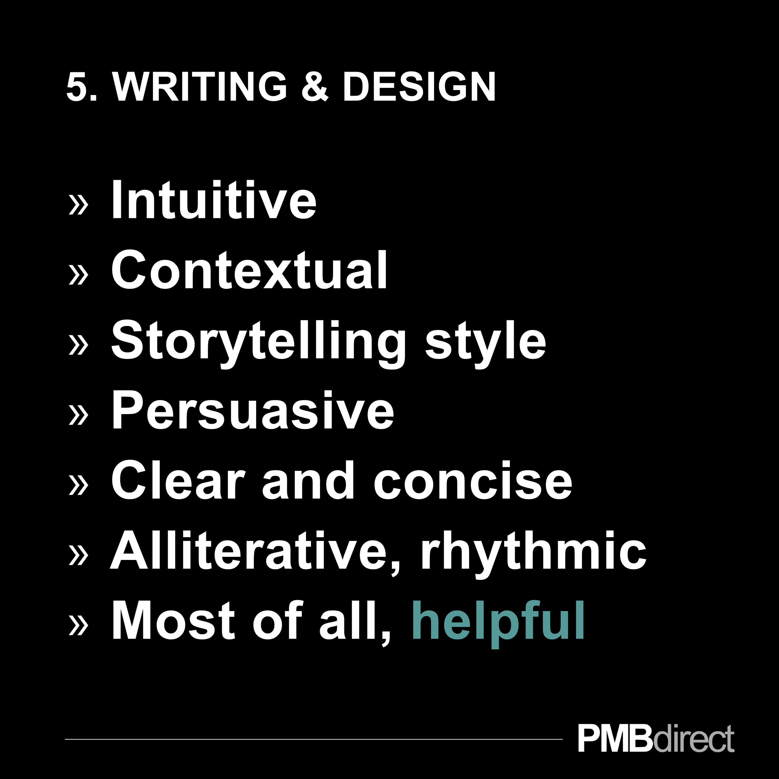
Write to evoke a feeling. Don’t write strange things, instead match the readers. Use the invisible friend technique to write to.
The first sentence should evoke curiosity.
Pace and lead your reader. Be like them in important ways by speaking like they do and using their thinking. By doing this you become like them and they begin to trust you. From there you can lead the people to where you want such as moving towards your end goal.
Write in direct sentences as this is one of the most important tips. Example: “The boy hit the ball”, not “The boy was hit by the ball”. Make your writing easy to read.
No jargon, adjectives, adverbs, or cliches. Act like people give you $100 per word you take out of your writing that lets it keep the same meaning.
Brevity = brilliance. People think you are brilliant when you speak in fewer words. Write in plain talk.
Sixth grade vocabulary. Use simple words so that you can pace your readers and then be understood easier.
Musicality, percussion. Words have certain sounds. Some things just sound ugly so make sure they flow together well.
No ugly words such as moist.
Consider associations. Make sure that you don’t associate two different things when writing.
Visual language. We are visual people so use visual language when you can to better connect with your readers. Make them taste and feel something. The fastest way is to go visual so that they can see it.
Violate a norm. People like to feel danger.
End clever or provocative.
Design Tips
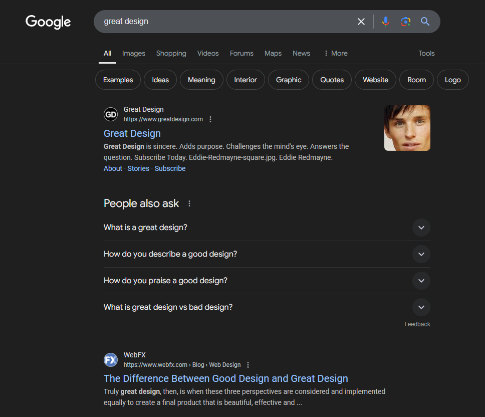
Great design is often subjective, but there are several universally recognized principles that contribute to what is considered excellent design. Here's a breakdown:
Purpose-Driven: The design should serve its intended purpose effectively. Whether it's a product, a website, or an app, it must be functional.
User-Centric: The design should be intuitive and easy to use, catering to the needs and expectations of its users.
Visual Appeal: It should be pleasing to the eye. This includes harmony in color schemes, typography, layout, and overall visual coherence.
Consistency: A consistent design language across all elements ensures a unified look and feel.
Originality: Great design often introduces something new or improves upon existing designs in a meaningful way.
Problem-Solving: It might solve a problem in a novel way or offer a new perspective on how things could be done.
Minimalism: Less is more. Effective designs often strip away unnecessary elements, focusing on what's essential.
Clarity: The message or function should be communicated clearly without confusion.
Engagement: Good design can evoke emotions, whether it's delight, intrigue, or comfort, creating a connection with the user.
Memorability: Designs that stick in the mind often do so because they resonate emotionally or through unique visual or functional elements.
Inclusivity: Design should be accessible to people of all abilities, considering factors like color blindness, motor disabilities, or cognitive impairments.
Universal Design: It should be usable by as many people as possible without the need for adaptation.
Longevity: Great design considers how a product or service will age, both in terms of aesthetic trends and functional obsolescence.
Eco-Friendly: Increasingly, sustainability is a hallmark of great design, focusing on materials, manufacturing processes, and lifecycle.
Contextual Awareness: Design should be sensitive to cultural contexts, reflecting or respecting the environment it's intended for.
Timeliness: While timeless design has its place, sometimes capturing the zeitgeist of a particular era or movement can be considered great design.
Craftsmanship: Whether digital or physical, the execution should be of high quality. This includes coding standards in software or material quality in physical products.
Performance: Design should not compromise efficiency or speed; it should enhance performance where possible.
User Testing: Great design often involves feedback loops where user input leads to iterative improvements.
Adaptability: The ability to evolve based on feedback or changing needs without losing its core essence.
Examples of Great Design:
Apple Products: Often cited for their blend of aesthetics, functionality, and innovation.
IKEA Furniture: Known for combining affordability, functionality, and modern design.
Google's Search Interface: Epitomizes simplicity and usability.
Great design, therefore, is not just about how something looks but how it works, feels, and integrates into the lives of its users. It's a holistic approach that considers aesthetics, functionality, innovation, and human interaction.
Next article in this series: Content Amplification: How to use organic and paid media to amplify your content


